At the Cinema Ritrovato making choices often comes down to flipping a coin: how do you choose between revisiting an old favorite classic, either in 35mm or as a digital restoration, and venturing out into the more unfamiliar territory of, say, Soviet cinema during the early years of the ‘Thaw’? Or between exploring archival treasures that give a vivid and diverse picture of cinema in 1915 (whether it’s luxurious Italian diva films or unblinking documentary films about the War), and digging into the partnership between film and jazz? Or between a series devoted to the early career of the resplendent Ingrid Bergman (whose daughter, Isabella Rossellini, will be in attendance to introduce the single classic from the star’s Hollywood years in the program, Casablanca) and a section on another, lesser-known leading lady, the Italian comédienne Valentina Frascaroli? How do you choose between binging on episodes of Feuillade’s great serial Les Vampires (1915) and enjoying the hell out of the situation comedies of Leo McCarey, the latest in a long line of Irish-American auteurs (Walsh, Wellman, Ford) given the retrospective treatment in Bologna? Just flip a coin… Choosing from this horn of plenty hasn’t been made any easier by the fact that, in its 29th edition, Il Cinema Ritrovato has become as much a ‘space machine’ as it is a ‘time machine.’ With programs devoted to new restorations by Martin Scorsese’s World Cinema Project – films by Lino Brocka, Ousmane Sembène, and Ahmed El Maanouni, respectively the first Filipino, Senegalese and Moroccan filmmakers ever invited at the Cannes film festival – the birth of the Iranian New Wave and the Japanese color film of the first half of the fifties, the festival has never been more international.
There’s no denying that, for all the cheers, there’s is a black border around this year’s edition: with the death of Peter von Bagh, the great Finnish critic, historian, filmmaker, who was the Ritrovato’s artistic director for thirteen years, the festival has lost a parent. More than anyone, Peter von Bagh embodied the Ritrovato’s international identity, cinephile energy and enthusiasm and laidback, easygoing, unpretentious spirit. His work in fictional and documentary cinema, his legacy in words, images and sounds, is justly celebrated this year (for a round-up of tributes see, as always, David Hudson’s Keyframe site).
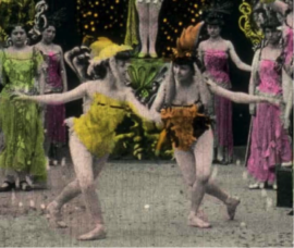
Peter’s memory is justly served by the fact that this black border surrounds one of the most colorful editions in years. Color, either applied by hand, stenciled, tinted or resulting from new photographic systems and processes, has been a continuing attraction and point of interest at the festival, both in the ‘cento anni fa’ series and in the ‘cinephile’s heaven’ that constitutes the largest section of the program. When ooohs and aaahs were heard echoing around the Piazza Maggiore where the open-air screening of Louis Malle’s Ascenseur pout l’échafaud (1957) was held in celebration of Gaumont’s 120th birthday, this wasn’t because flashes of lightning were announcing the biblical downpour that would ruin the Gaumont party, or because Maurice Ronet got stuck in that elevator, but because of the Chronochrome colors of a short film from 1912 showing vacationers and bathers at Deauville. Similar sounds of delight could be heard at the EYE Filmmuseum Amsterdam’s presentation of the only surviving images from Mario Caserini’s Una notte a Calcutta (1918), one of Lyda Borelli’s last films. Chromatic stills from that movie are featured in a stunning new book presented after the EYE program, Fantasia of Color in Early Cinema, edited and with essays by leading specialists of early cinema, Tom Gunning, Joshua Yumibe, Giovanna Fossati and Jonathon Rosen, and illustrated with early color film images from the EYE film archive that are so iridescent they make the book look, as Martin Scorsese puts it in his preface, like an illuminated manuscript. Two other divas of the silent Italian cinema, Pina Menichelli and Francesca Bertini, were represented by their two canonical films from 1915, Pastrone’s Il Fuoco and Bertini’s own Assunta Spina, that had the equally stunning amber, green and fiery reds of the original tinting and toning process restored according to the method developed by Belgium’s own Noël Desmet. An added treat was that the latter film, an unusual diva drama in that it leans more to ‘verismo’ than to the standard curvy art nouveau stylings and bourgeois settings, was projected al fresco by a picturesquely steaming carbon arc projector.
Another birthday, Technicolor’s 100th anniversary, is fêted this year with screenings of restored studio classics like On the Town and Cover Girl on DCP, both offsetting their deeply saturated palette with the blinding white of Gene Kelly’s teeth. But the real attraction is the vintage Technicolor 35mm prints of Fantasia, Vertigo, All That Heaven Allows (courtesy of the Cinémathèque Royale), Anthony Mann’s The Heroes of Telemark, Jacques Tourneur’s Great Day in the Morning, and Jacques Demy’s Model Shop. Yesterday’s projection of the 1956 Tourneur film, an underrated and very smart Superscope western that ends on a pictorial homage to Maurice Tourneur’s Last of the Mohicans (1920), all turquoise, greens and greys to fit the somber mood, reminded us what film can be like: scratched, jumpy and somewhat faded, the BFI print showed that film is indeed a living, breathing organism, and that, for all the frustration deterioration can cause, the nature of the material base is part of the show.
To make sure the crowd does not stop ooohing, aaahhing and pondering the nature of existence, a 70mm copy of 2001: A Space Odyssey and an almost unseen dye-transfer print of Terrence Malick’s The Thin Red Line, are to be screened this week en plein air at the Piazza (pray that whatever is between heaven and earth produces favorable weather fronts!). After shutting down its American plants in 1975, Technicolor briefly reintroduced the dye transfer process in 1997 for use in prestigious restorations and a small number of big studio films that wanted to achieve a distinct period look. The Thin Red Line was one of those films, but because post-production on the film took so long and a release date was set, there was no time to make dye transfer prints. Technicolor only made one such print as a gift to Malick and, apparently, that’s the copy we’re going to be seeing tonight. [This blog post was written June 30 – Ed.]
While the curiosity about the new Kodachrome look of Malick’s masterpiece reaches fever pitch, another question on the minds of those nerdy cinephiles assembled here in Bologna is how 3-D would affect the Technicolor experience. The answer was to be found in the 2K digital restoration of MGM’s Cole Porter musical Kiss Me Kate (1953) [pictured above], the most prestigious attempt by a big Hollywood studio at the time to enlist stereoscopy in the battle against television. Because the film was shot in polarized 3-D, it was screened with two synchronized projectors producing two views on the screen with different polarization. Outfitted with active shutter glasses allowing only one of the images into each eye, we could fully appreciate the pastels and purples of the ‘Shakespearian’ tights, the crimson of Kathryn Grayson’s gown or the shameless pink of Ann Miller’s bodice. Predictably, the ‘right eye/left eye’ 3D drops leggy Miller right in your lap and most all the cast members visibly have a good time throwing stuff at the camera and the audience. It’s almost enough to distract from a tired backstage plot and by-the-book direction from musical genre specialist George Sidney.
Festival director Gian Luca Farinelli likens seeing a vintage Technicolor print on screen to walking through the Uffizi. My most striking encounters with color at the festival thus far, however, belong to different traditions. If the final film by montage master Vsevolod Pudovkin, The Return of Vasilij Bortnikov (1952), released two and a half weeks after Stalin’s death, at first glance seems like a relic of the Stalinist past, with the tractors and buxom peasant women evoking the iconography of Soviet political posters, the soft hues of the Magicolor process – a Soviet subtractive color system – also establishes a distinctly lyrical tone. The way master cinematographer Sergej Urusevsij, who would go on to shoot Kalatozov’s great masterpieces The Cranes are Flying (1957) and I Am Cuba (1964), uses muted autumnal colors and soft bundles of light falling through the single window of a country cottage, evokes the Dutch masters and looks ahead to Georgi Rerberg’s work on the ‘dacha’ scenes in Tarkovsky’s The Mirror (1975), shot on Eastman Kodak film with an eye to Mosfilm color films of the immediate post-War period.
Teinosuke Kinugasa’s Jigokumon/Gate of Hell (1953) is an established classic, that won the Academy Award for best foreign picture mainly because of the sumptuousness of its photography and costume design that explicitly evoke Japanese scroll painting. But I had forgotten how good it really is. As subtle as Mizoguchi’s Sansho the Bailiff in the way it probes Japanese feudal psychology, Gate of Hell is of course much more expressionist in the way it uses the vibrant, lavish tints of the Eastman system to color-code characters, settings and emotions in fierce varieties of gold, blue, green and red. But in its last half hour, pace, framing and mise en scène take over from color design to make for an experience as intense, engrossing and aesthetically breathtaking as anything in the great master’s canon. Incidentally, one of Mizoguchi’s two color films, both made in 1955, Shin heike monogatari/New Tales of the Taira Clan, set in the same Heian era as Gate of Hell, was also shown. Like Gate of Hell it uses the minute in-studio recreation of Japanese twelfth-century architecture to achieve subtle lines and framings, a studied architectural approach that is contrasted to the more sweeping ‘open’ approach to outdoor crowd scenes. (The scene with hundreds of monks carrying torches crossing the forest is especially impressive.) The difference between the two highly decorative color films is that Kinugasa’s attention to the pictorial attraction of flickering candle light, to billowing draperies roused by both fire and wind, turn his film into a more sensory experience. It is clear, however, that both Gate of Hell and New Tales of the Taira Clan were seen by Hou Hsiao-hsien and Mark Lee in preparation for their own medieval saga of imperial politics and impossible love, The Assassin.