In his 2010 book Hollywood Lighting: From the Silent Era to Film Noir, film historian Patrick Keating convincingly argued that ‘film noir’ is not so much determined by its vastly differing range of subjects and stories—from seedy crime adventures to police procedurals—but by the way it pushed visual techniques and the expressive possibilities of high quality fast black and white film stock, to a degree few other studio-produced genres in ‘Classical Hollywood’ did. Building off this, film historians completely redefined the idea of noir, claiming that the real reason film noirI am sidestepping the ongoing discussion here if noir needs to be considered a genre or a movement and what that means for delineating the period of classical noir—using the more or less conventionalized time frame of 1944-1958 as the period for classical noir. all but disappeared from American cinema in the late 1950s and early 1960s had more to do with the introduction of widescreen and less performative color negatives, than with changing audiences tastes. ‘Neo-noir’ then only came about when color film stock finally offered the same expressive qualities in the late 1970s—thus relegating early neo-noir films such as Chinatown (Roman Polanski, 1974) and Night Moves (Arthur Penn, 1975) to an intermediate cycle somewhere between ‘classical noir’ and ‘neo-noir’.
This visual history of film noir has received far less attention than the subject-driven approaches that were fueled by the original French articles that coined the term. And yet, technical development (or lack thereof) in film stock and lenses drove the relatively slow advent of neo-noir after the original noir had virtually disappeared from the studios’ production slates.
I. The Look of Noir
The traditional history of film noir’s visual style holds that it replaced the classical high key (low contrast) three point lighting, use of day-for-night, shallow focus and normal length lenses, with low key and imbalanced lighting, deep focus and use of wide lenses, as well as the use of extreme angles and ‘dissymmetrical’ mise en scène, suggesting that noir stood apart in significant ways from the traditional continuity system in the 1940s Hollywood studio system. Yet noir was by no means anti-classical and was in fact just another modus of the ‘classical studio system’ and part of broader evolutions within 1940s American filmmaking. What are generally perceived as being the distinguishing characteristics of noir cinematography, are much more widely embedded within the Hollywood lighting tradition than might seem at first sight. Noir’s visual style is much more a matter of emphasis and gradation within the existing modes of practice, rather than a set of completely different genre-defining visual assets. The same can be said of noir’s thematic, narrative and visual structures. We could go even further, and reject the generalized idea that much of noir’s visual tropes were introduced by émigré directors that brought the German Expressionist style into Hollywood productions and made it one of the defining elements of the noir genre, a genre most of these directors worked in during their heydays within the Hollywood system.
Most of these claims are easily supported by a close viewing of several keys films that preceded film noir proper. One doesn’t have to look much further than James Wong Howe’s cinematography for William K. Howard’s The Power and the Glory (1933) to see that elements of noir style were present long before classical noir appeared on the scene. And to make a case for noir’s expressionism growing as much out of regular Hollywood practices as out of any other supposed influence, one can point to widespread earlier ‘expressionist’ imagery in films like Blind Alley (Charles Vidor, 1939), A Marked Woman (Lloyd Bacon, 1937), The Petrified Forest (Archie Mayo, 1936) or even as far back as John Ford’s The Brat (1931). The same observations hold true for noir’s prolific use of tilted angles, wide angle lenses and deep focus staging. Cinematographer Gregg Toland is historically credited as being one of the key figures in introducing these elements into the vocabulary of the Hollywood studio film, but in the wake of the highly influential Citizen Kane (Orson Welles, 1941), these innovative and to some degree very new visual elements were adopted by other genres as much as by crime dramas (the standard term for noirs before French critics coined the term ‘film noir’). Titles such as William Wyler’s The Little Foxes (1941) or The Best Years of Our Lives (1946) may not have been held in high regard by Jean-Pierre Chartrier, the French critic that introduced film noir to the world, but they showcased a lot of the same visual strategies as the films that would get labelled ‘film noir’. Even noir’s proclivity for flashbacks and the use of (Freudian) psychology and dream sequences was part of a general tendency in narrative structure in the 1940s, also found in melodramas such as Our Town (Sam Wood, 1940) and thus definitely not restricted to crime dramas.
What then to make of this elusive set of very loose genre-defining elements that are supposed to tie together the concept of film noir? If neither the visual language nor the narrative structures and themes were specific to film noir, what element is able to define this cycle of very different films between 1944 and 1958 as being noir? One answer has been to look at socio-cultural phenomena that undergirded noir’s downbeat world view, another has been to try and single out which of noir’s visual tropes was different enough to be singled out as being instrumental in the visual concept of film noir. As noted above, these ideas have mainly focused on noir being anti-traditional vis-à-vis contemporary American films, a notion that has been heavily challenged since and is ready for re-evaluation.
Whether one subscribes to these challenges and acknowledges that noir was well embedded within the studio system, or not, does not take away from the fact that film noir did have a preference for the use of a certain kind of imagery. Even if those images were to be found in other genres as well, it is undeniably so that stark contrasts in lighting, deep focus staging, the use of wide-angle lenses and tilted or heavily angled camera positions tended to be more present in films noir. One might argue that film noir used these techniques to an extreme degree, implying that the visual style of noir was more a matter of emphasis than exclusivity. A salient observation is that these are all (apart from the ‘Dutch’ or ‘Tilted’ angel that had been around for a long time) possibilities that grew out of technical developments in the late 1930s and early 1940s. The deep staging techniques and the sharp chiaroscuro that started to dominate American cinema in the 1940s were brought about when Toland (and others) started experimenting with the use of Kodak and Agfa’s new film stock, opening up possibilities for a new kind of cinematic language.
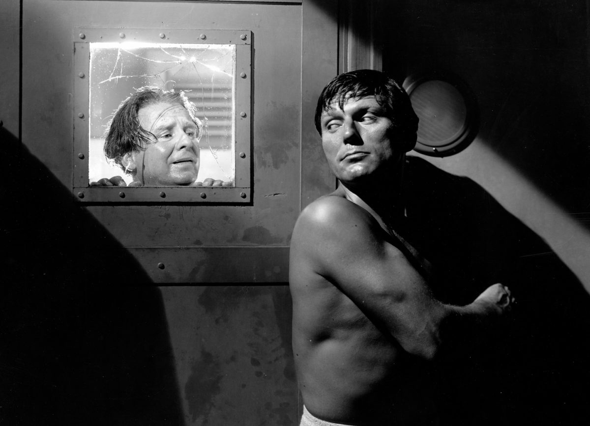
In this perspective, the technical possibilities of mainly Eastman-Kodak’s Super XX film stock was at the heart of the visual developments in the 1940s’ Hollywood studio system and film noir. Put differently: without those technical advancements, the particular visual language of film noir would have been impossible and noir—even though other genres used them as well—pushed these possibilities to extremes, by resorting to unusually stark contrasts, night-for-night shooting and an extremely expressive use of lighting. A famous example illustrates this idea: in T-Men (1947), Anthony Mann and DOP John Alton stage a key scene by creating a whiteout using steam as a contrast for the dark silhouette in the foreground, putting the possibilities of faster film stock on full display. This is but one example of noir’s tendency to maximize certain visual elements that—while present elsewhere—could be pushed to heightened levels in order to create the unstable and ‘unheimlich’ filmic worlds that have traditionally been associated with film noir.
Sticking to this technologically driven narrative, an alternative history of noir can be built, stating that classical noir de facto disappeared from American filmmaking in the late 1950s and early 1960s, due to the switch to colorObviously, John M. Stahl’s Leave Her to Heaven (1945) is always the exception to the rule, along with a few lesser examples – but as a genre or cycle, film noir is definitely tied to the use of black and white film stock. in regular studio practices that robbed film noir of much of its expressive capabilities. It was then the technical advancement in color film stock that allowed for a return (in color) to the visual style of black and white noir, giving birth to neo-noir in the 1970s and 1980s.
II. The Late 1950s
The factual technical evidence at the very least does point to the almost complete switch to color film stock in the late 1950s and early 1960s, and the vast difference between lighting possibilities for color and B/W film stock: in 1956 Angenieux marketed a new ultra-wide-aperture lens (25 mm) that vastly improved upon earlier similar lenses and in combination with the fastest (i.e. most light-sensitive) B/W film (250 ASA) made it possible to film under about any lighting conditions. Kodak’s Super XX B/W film was the preferred stock and allowed for any kind of contrast or lighting the filmmakers saw fit. At the same time, even the fastest new color film stocks that appeared near the end of the 1950s, had at best a speed of around 100 ASA, which drastically reduced the lighting and contrast possibilities for color films. In 1953 Eastman Kodak devised a new intermediate duplicating negative that allowed for some color correction in the final print, but even with these technical advancements, the argument stands that the expressive possibilities as far as contrast, chiaroscuro and lighting are concerned were indeed much more limited for color cinematography than they were for B/W.
Still, it does seem to be the case that the possibilities to circumvent these limitations were available when needed: For Moby Dick (1956), John Huston and cinematographer Oswald Morris had the laboratory manufacture an extra intermediate B/W negative that was combined with the color negative for the final print in order to add extra deep blacks. Moby Dick was however an extremely high budgeted production and while it is a misconception that the majority of films noir were low budget affairs, the possibility of going through this expensive extra process was probably only an option for the most prestigious high budget titles. The technical possibilities of color film stock were limited to such a degree that they did not allow for the same kind of more extreme expressive cinematography that B/W did—at least not to a degree that would suit a genre that tended to maximize these possibilities. If one upholds the argument that film noir’s visual palette did require exactly those stylistic possibilities, then the case can be made that with the switch to color in the late 1950s, film noir was robbed of one of its core elements.
An interesting aside here is the association between 1940s’ B/W imagery and a ‘realistic’ rendering of the world, more precisely the affinity between the B/W street photography of Weegee, Lisette Model, Robert Frank and Willian Klein—a photography that mainly depicted inner city urban life and the seedier parts of town—and noir film grammar. The grim, urban reality of inner-city life was tied to a B/W aesthetic, a tie that was re-enforced in film noir aesthetics of the 1940s and early 1950s. In this way the switch to color did not only rob film noir of technical possibilities that were at the heart of its expressive visual language, but also of its ‘aura’ of gritty inner-city realism that was tied to its themes and narratives. It will be a salient detail in the visuals of neo-noir, that color brought with it a new set of ‘noir landscapes’ that shifted away from big city realism and ventured into the openness of archetypical Americana.
III. The 1960s
While the technical evidence for the 1950s did support the claim that the studio’s general switch to color robbed noir of most of its expressive possibilities, the map of technical advancements for the 1960s presents a somewhat more nuanced view.
One of the major developments in filmstock in the early parts of the decade was the release of Eastman Kodak’s new color negative, that drastically improved definition and color rendition. Remarkably, Point Blank (John Boorman, 1967), the only film that is generally acknowledged as a proto- neo-noir, used an even newer version of this exact filmstock at the end of the decade, for its striking use of color contrasts. The new development processes of the 1960s—using higher temperature development baths—also allowed for films to be ‘pushed’ to a higher speed in development. This enabled DOPs to shoot color with less light required, correcting this in the final print through the development process. A crippling technical downside however, was the loss in saturation and hues, which made high contrast cinematography still a continuous problem. This makes Point Blank’s achievements even more exceptional.
Another technical advancement that aided in obtaining photographic effects closer to the sharp contrasts of B/W’s chiaroscuro effects that were part of classical noir’s core visual language, was the development in 1964 of new light units that allowed for much sharper shadows, returning a somewhat lost layer of expressive cinematography to color film’s visual grammar. This latter development ran actually counter to the European influenced lighting style of the French ‘Nouvelle Vague’ that saw Raoul Coutard use bounced lightCoutard hid small lightning units in the ceiling, bouncing light off the walls and ceiling, creating a regular soft spread of light, that allowed him to shoot under less than ideal circumstances—he first used the influential technique on the indoor sets of Jean-Luc Godard’s Le Petit Soldat (1963)., a lighting style that would prove to be very influential and inspire Hollywood DOPs to do the same—moving further away from high contrast imagery.
Generally speaking, the late 1960s saw a tendency towards a desaturation of colors—Conrad Hall used fog filters and controlled development in order to heavily desaturate the color palette of Butch Cassidy and the Sundance Kid (George Roy Hill, 1969) and controlled development also was at the basis of the remarkable color desaturation of Reflections in a Golden Eye (John Huston, 1967)—a tendency that shunned away from the high contrast images of the B/W photography of classical noir.
One might conclude then, that while strictly speaking the technical means for a return towards noir’s visual palette were more or less available, film noir had disappeared from the American cinematic landscape to such a degree that no studio or producer in the midst of a rapidly changing film culture would have considered reviving film noir or have a director experiment with adapting the genre to color cinematography. Evidence to that claim is the fact that the few films that actually ventured into that direction—the remake of The Killers (Don Siegel, 1964) being a prime example—were never considered to be actual ‘noir’—the lack of any connection to the visual style being a main consideration. A mention of Samuel Fuller’s 1960s films is necessary here, as some claim them as early neo-noirs. Yet, while Fuller’s films from this period certainly incorporate noir elements, they are too idiosyncratic and visually eccentric and much more anti-classical than classical noir ever was—putting them more in line with European art house influences than with classic noir.
IV. The 1970s
One of the most important technological advances of the 1970s was situated in laboratory work and was a continuation of a practice that started in the second half of the previous decade: ‘pre-flashing’ the negative before it was used for shooting, became a widely used technique and was mostly used to lower the contrast of the negative and the color saturation. The widespread use of this filmstock manipulation, lead to a typical ‘washed-out’ visual palette with a low saturation in films like John Boorman’s Deliverance (1972). This method was also used for some of the very first canonical neo-noirs: Night Moves and The Long Goodbye (Robert Altman, 1973), the latter film using an older Kodak negative and pre-flashing it to obtain a very low color saturationThe same holds true for Dirty Harry (Don Siegel, 1971), The Friends of Eddie Coyle (Peter Yates, 1973) and The French Connection (William Friedkin, 1971)—DOP Owen Roizman stated his whole approach was based on the idea of the images needing a “dismal dreary look” but while these titles are sometimes included as neo-noir, that is by no means a generally accepted idea and most studies do not include them as such.. As noted above, this technique actually ran counter to the high contrast look of the classical noir and its results were even enhanced by the regular use of fog filters.
It stands to be noted that the desaturated colors of the first cycle of neo-noirs (there is a salient omission here, that I will turn to below) perfectly matched the changing filmic landscapes of these films. No longer were the inner-city jungles of northern American cities (New York obviously being chief among those) the dominant world of noir, as the preferred cityscapes now shifted to the sun-drenched southern states. Florida’s pastel-colored light or the subdued hues of the Californian skies and landscapes perfectly suited the desaturated color palette that was obtained by ‘pre-flashing’ the negative. This dichotomy between city and non-city/private space has always been an important part of noir’s themes and once again some of these elements can be linked to tendencies in other contemporary visual media and even the changes in 1970s photography and architecture. The same move outwards of the city can be seen in the eerily empty street photography of Bernd & Hilla Becher, Thomas Struth, Andreas Gursky and Thomas Ruff. The anonymous urban wastelands outside the city always functioned as some kind of liminal space for film noir but they become the focus of noir’s filmic space in neo-noir, losing both its moral and humanistic side as street photography did and complicating the idea of ‘civitas’ by completely blurring the lines that separated the traditional city both morally and spatially from its surroundings. It is this idea that materializes both in 1970s neo-noir’s narrative structures and underlying themes, as well as in its visual style, a style that was perfectly served by the technical change that was brought along by ‘pre-flashing’ and ‘desaturation’, but that was a far cry from classical noir’s sharp B/W contrast. However, the move towards desaturation was countered by another cinematographic ‘movement’ that opted for a radically different approach.
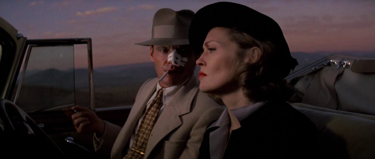
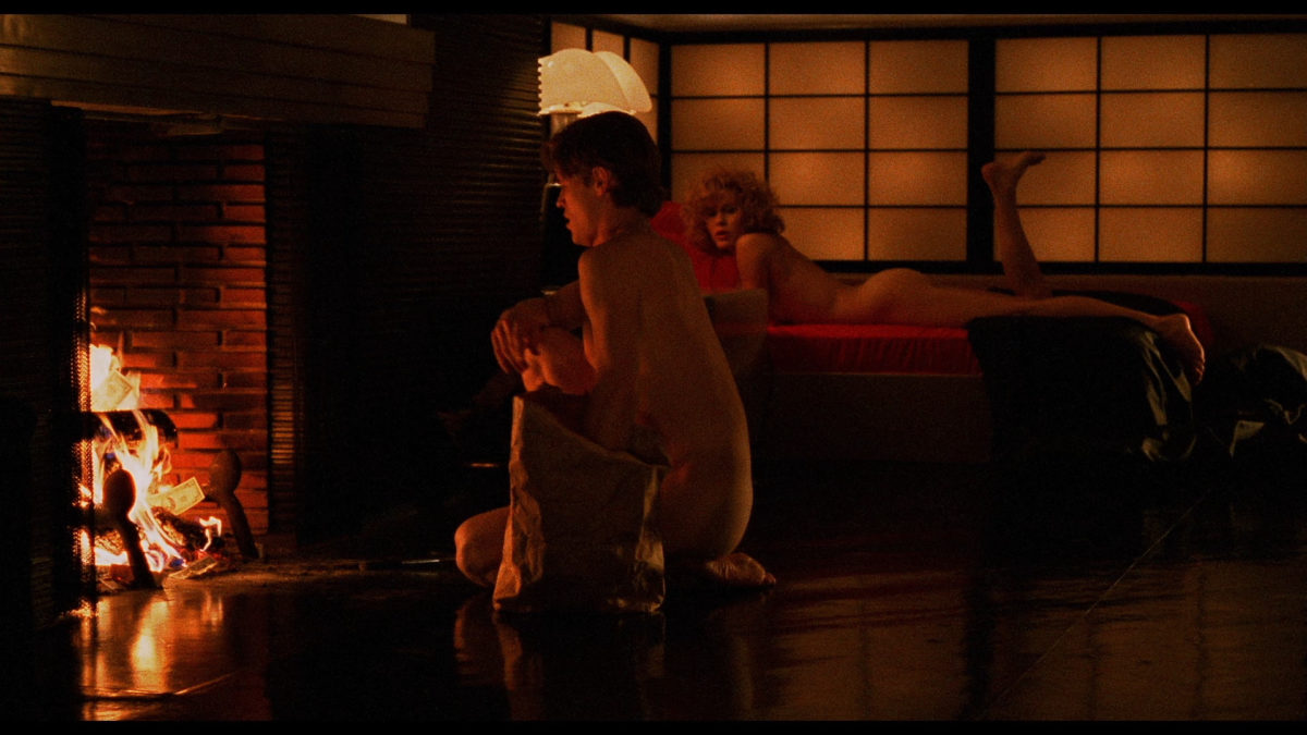
For The Godfather (Francis Ford Coppola, 1972), cinematographer Gordon Willis took to underexposing his negatives, while insisting on a regular development, which resulted in a slightly reduced definition, but markedly higher color saturation. This move towards higher saturation gained in popularity as the decade wore on and lead to a completely new form of ‘pre-flashing’ that would become instrumental in the changing aesthetic preferences for the late 1970s and early 1980s and that would eventually evolve into the ‘neon rainbow’ that is neo-noir’s most salient visual element. The move towards a high contrast look in color and lighting was present however in one of neo-noir’s first major titles: Roman Polanski’s Chinatown. In order to get the desired ‘retro look’ for the film, Polanski and his DOP John Alonzo used a then brand-new technique invented by the British cameraman Gerald Turpin, called the ‘Turpin Colorflex System’ (later called ‘Lightflex’). The technique used reflected light from a colored filter to create starker contrasts and the browns and beiges used in Chinatown gave a ‘retro feel’ to the overall imagery of the film. The result is a film that does indeed look different from its contemporary neo-noir counterparts and that might be categorized as the very first true neo-noir from a strictly visual perspective. While other films opted for a visual style that was very different from that of classical noir, Chinatown did return to the high contrast look and its expressive use of color was arguably the very first ‘translation’ of classical noir’s visual grammar into a neo-noir color version. This means that any account of neo-noir being ‘born’ in the 1980s, based on visual claims, will always have to grant Chinatown an ‘exception’ status, based on these same arguments.
Another important technical change in this regard is the elimination of color corrections, caused by the difference between natural and artificial lighting on film sets. While ‘traditional’ cinematography corrected these spectrum variations in the final print, the 1970s saw a growing tradition of consciously eliminating such corrections, resulting in the glare of fluorescents lights being visible in films like The French Connection, The Sugarland Express (Steven Spielberg, 1974) or Taxi Driver (Martin Scorsese, 1976). This tendency became even more important when cinematographers like William Fraker or Andrew Laszlo started to combine this lack of correction with expressive use of colored gels, giving birth to the ‘neon’ look of the 1980sThis new expressive use of colored light would also prove to be highly influential or a new strain of European cinema, mainly France’s ‘Cinéma du Look’ and the BBC generation (Beineix-Bresson-Carax) that revolutionized France’s cinematic landscape in the early 1980s. in Exorcist II – The Heretic (John Boorman, 1977), The Warriors (Walter Hill, 1979) and another Walter Hill classic The Driver (1978), which stands out as a notable predecessor to the visual look of 1980s neo-noir. Yet, by the late 1970s and early 1980s, even rather modest dramas tended to use the same techniques. Still, neo-noir pushed these to their extremes, coming full circle with its classical period’s counterpart—noir not being anti-classical, but a style that maximized the use of some of the available conventions to a very high degree.
V. The 1980s
By mapping the technical advances throughout the decades, it is clear that near the end of the 1970s, post-classical noir had certainly started a move towards a distinctive color code, “as stylized in its ways as the high-key black and white of old” and the technical factors had aligned to allow for such an evolution.
An important technical change that brought about neo-noir’s definitive visual palette, was the introduction in 1980 of Fuji’s new fast color negative, which was particularly suited for filming night scenes. In the following years Kodak followed suit with a range of improvements, culminating at the end of the decade in a new negative emulsion that enhanced the already high sensitivity to light. Fuji’s new film was especially important in the early 1980s (eg. 1982’s 48 HRS) and with the added possibilities of the ‘Panaflasher’ (1970s ‘Lightflex’ now in-camera) and the technique of enriching final prints with extra blacks and silver by running them through the developer a second time (eg. Top Gun – Tony Scott, 1986), color negative’s expressive possibilities had finally caught up with black and white film stocks of the 1940s.
Another important evolution was the ever-increasing use of colored light in cinematography. Some influential cameramen like Ed Lachman infused a colored version of ‘noir sensibility’ into the New York New Wave scene of the early 1980s. His use of strongly saturated colors and lighting was influential for the broader visual style of the decade. This use of this colored light is central to the features that define the look of neo-noir. While, the use of colors in Manhunter (Michael Mann, 1986) or Blood Simple (Coen brothers, 1984) is also found (to lesser degree) in John Hora’s cinematography for Gremlins (Joe Dante, 1984) or Matthew Leonetti’s for Commando (Mark L. Lester, 1985)—contemporary films situated in completely different genres—neo-noir maximizes these tendencies and pushes techniques to the limit.
A first example of neo-noir’s tendency to maximize certain visual trends would be William Friedkin’s brilliant neo-noir To Live and Die in L.A. (1985). Belgium’s most prolific film critic (and later artistic director for the Ghent Film Festival), Patrick Duynslaegher, praised the film for the way in which “every frame is set up as a cover for an aggressively marketed rock album and the whole film is a rhapsody of decadent aesthetics, sublime lighting, postmodern editing and overwhelmingly powerful images of male bodily power and destruction.” Duynslaegher rightly observes the way in which certain visual tendencies of the decade are pushed to almost absurd extremes, adhering to exactly the same processes at work in classical noir. We can find a similar drive to push cinematography in the work of John Alton. Like Alton before him, To Live and Die in L.A.’s DOP Robby Müller does not sacrifice every rule in the book of lighting, becoming anti-classical, but manages to push the boundaries to extremes. While one might argue that the same could be said about a uniquely baroque example like Peter Greenaway’s The Cook, The Thief, His Wife and Her Lover (1989), no other genre tends to go for this approach like neo-noir does. Streets of Fire (Walter Hill, 1984), superbly photographed by Andrew Laszlo in pure noir style, is another example of this trend to maximize reigning visual trends. This same approach to neo-noir could also be found in other visual arts, such as the ‘New Figurative Art’ of Eric Fischl, whose painting Bad Boy (Oil on Canvas, 1981) looks like a neo-noir scene frozen in time (and bears a striking resemblance to To Live and Die in L.A. ‘s aesthetic).
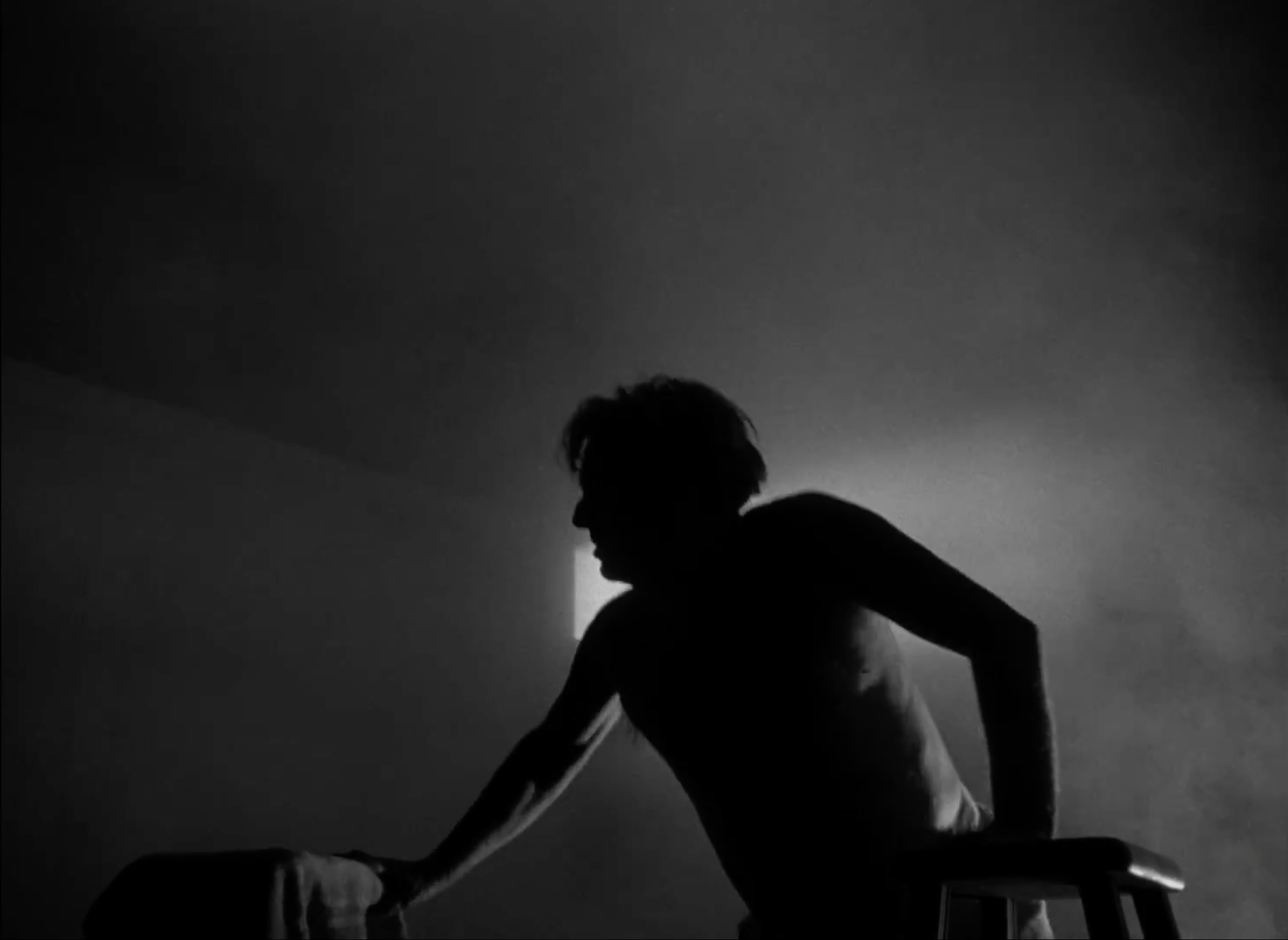
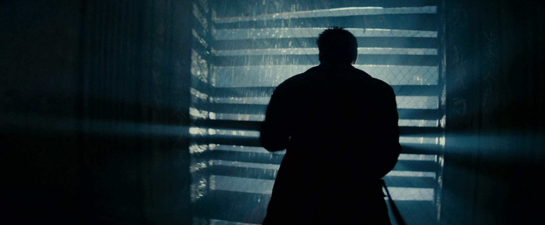
The best way to illustrate the argument however, is to compare two scenes, separated by four decades of filmic tradition, but convincingly demonstrating the way in which 1980s neo-noir finally started using certain techniques again in much the same way as classical noir did; in both cases a similar scene could not have been found a decade earlier. In Blade Runner (Ridley Scott, 1982), DOP Jordan Cronenweth uses lots of backlighting, creating a whiteout and blurred wall of light, which underexposes the actor in the foreground. This is exactly the same effect John Alton aimed for in Anthony Mann’s T-Men, albeit with the use of different techniques. Patrick Keating’s description of the ‘steam bath’ scene in that film, would also fit the Blade Runner scene perfectly: “Alton can create a sense of mystery by using light tonalities just as easily as he can by using dark tonalities.” The speed of B/W film stock in the 1940s allowed this kind of extreme contrast use, as did the new color film stocks in the 1980s, allowing for an equally extreme use in Ridley Scott’s futuristic neo-noir classic.
It was the act of maximizing stylistic traits that granted neo-noir to its ‘noir’ status—whatever narrative, thematical or symbolic traits that might be at work in the switch from noir to neo-noir, from a strictly visual point of view, neo-noir only came about in the early 1980s, when the technical possibilities allowed noir to regain its status as a genre (or movement, although in its ‘neo’ stage it has definitely evolved into genre) that pushed stylistic traits to their limits.